






At a glance
Role. Designer and builder, for myself and two partners.
Timeline. September 2026.
Stack. Next.js 16, Tailwind 4, Supabase (Postgres, Auth, Storage, row-level security), Recharts, web push, Vercel. PWA, installed on three phones. Built with AI, in Claude Code and Cursor.
Status. Live and private. Shown here with fictitious numbers.
The problem
Three people, one project far from home, and a lot of small payments made by whoever happened to be there: a notary fee, an agency, a hotel, a tool. The usual answer is a spreadsheet nobody updates and a WhatsApp thread nobody can search. What we needed was simpler to say than to build: who paid what, who owes whom, what are we deciding, and what has already been done.
Constraints
Three users, not a market. No onboarding, no marketing, no empty states for strangers. Every screen could assume the three of us.
Used on the road. Expenses are entered in a car, at a counter, in a hotel room. The form had to work one handed, with a progress bar instead of validation errors.
Private by construction. Supabase row-level security means the database itself decides who sees what. There is no admin panel and no way to look at another group's data.
Built fast. The design had to come out of a system, not out of a long exploration.
Process
I wrote three visual directions first, all taken from Florence: intarsia (marble inlay), cupola (the Duomo), pavimento (the cathedral floor). The palette came from there: a deep Prato green, Maremma red, gold, and marble whites. The chosen direction keeps the green as the surface and uses one graphic motif, a fan of thin lines in the corner of every hero, like a sunburst or a stained glass window.
Then an audit against Apple's Human Interface Guidelines for the mobile layout, because the app is a PWA that has to feel native on a phone: tab bar, bottom sheets, a floating action button, safe areas.
Then the data model. Expenses, payments between members, splits, notes with states, comments, a change history per expense, and an activity feed with push notifications. Row-level security policies for every table before any screen.
Solution
A home that answers first
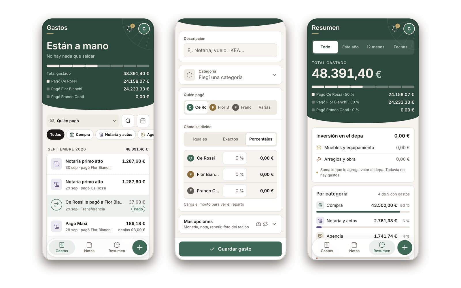
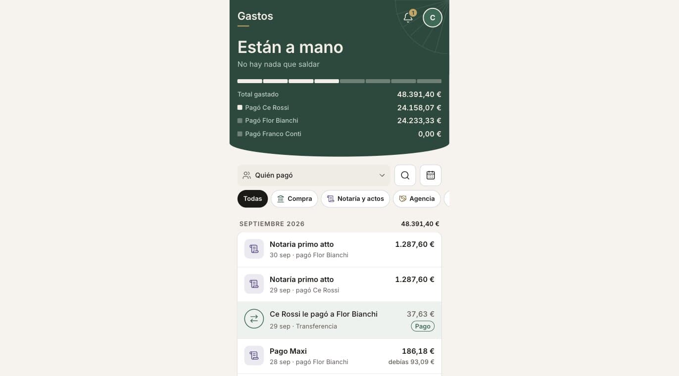
The home does not open with a table. It opens with a sentence: "Están a mano" or who owes whom, then the total and the share each person paid as a segmented bar. Below it, the ledger grouped by month, with filters by payer, category and date, and a search.
Key decision
The answer before the data. Most visits are a glance to check that everything is settled.
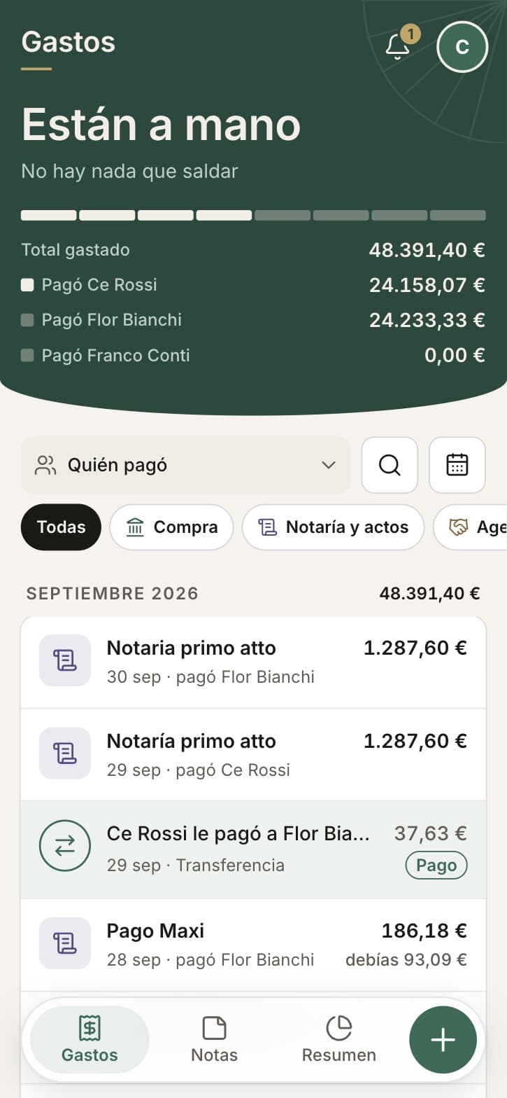
Gastos
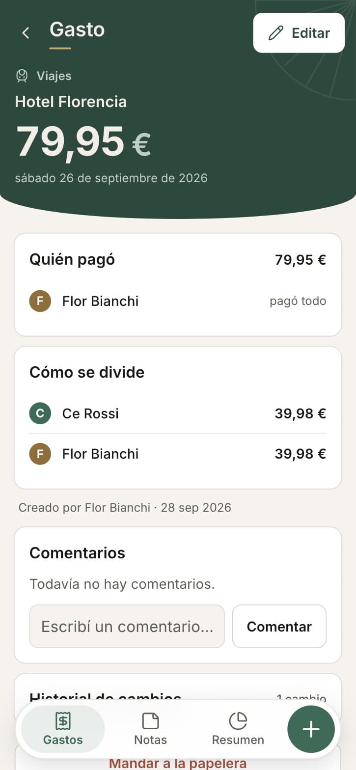
Expense
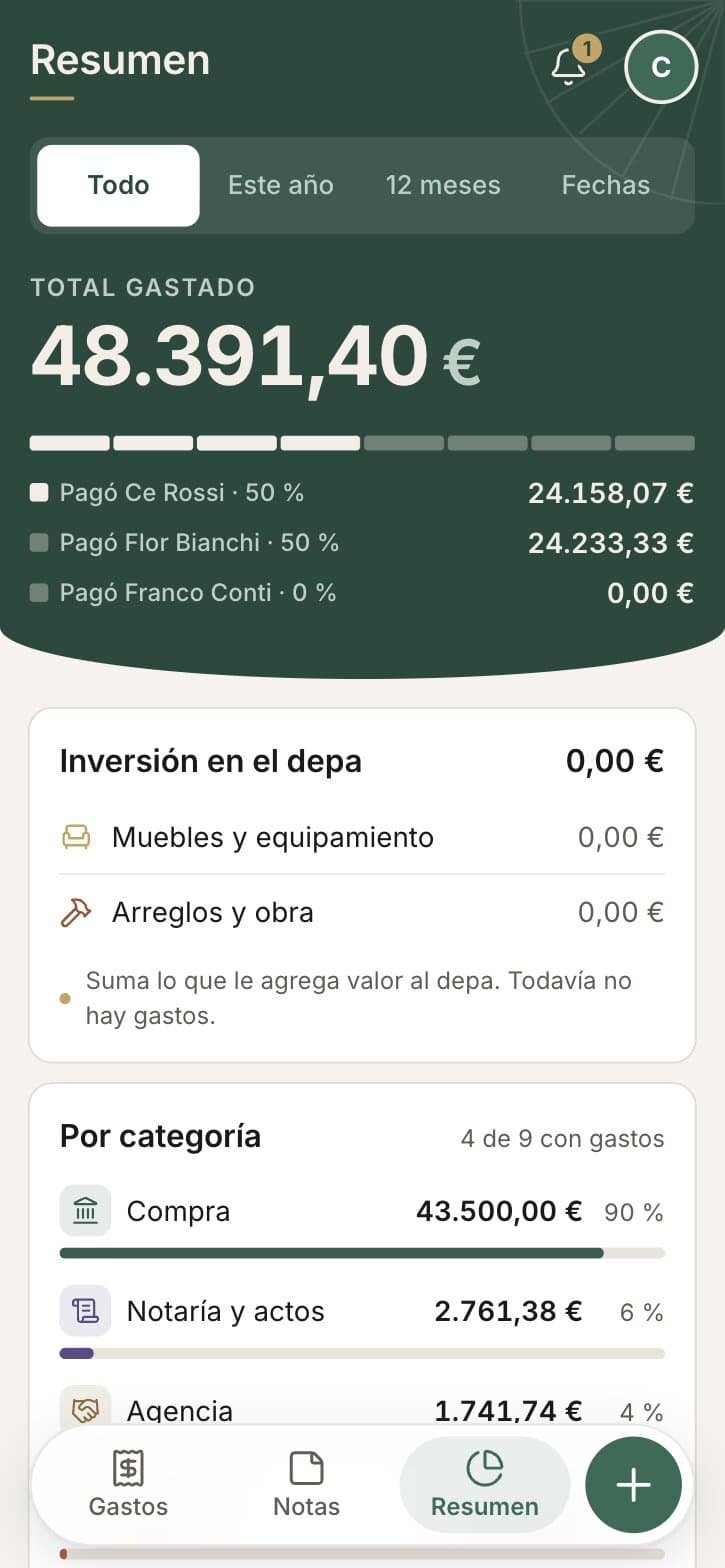
Resumen
An expense form as a checklist
Amount, date, description, category, who paid, how to split, and more options (currency, note, repeat, receipt photo). A bar with eight segments shows what is still missing: "Faltan: monto, descripción, categoría, división".
Key decision
Progress instead of errors. The form never shouts; it tells you what is left.
Trade-off
Eight fields is a lot for a quick entry. Smart defaults (today, equal split, the last payer) make the common case three taps.
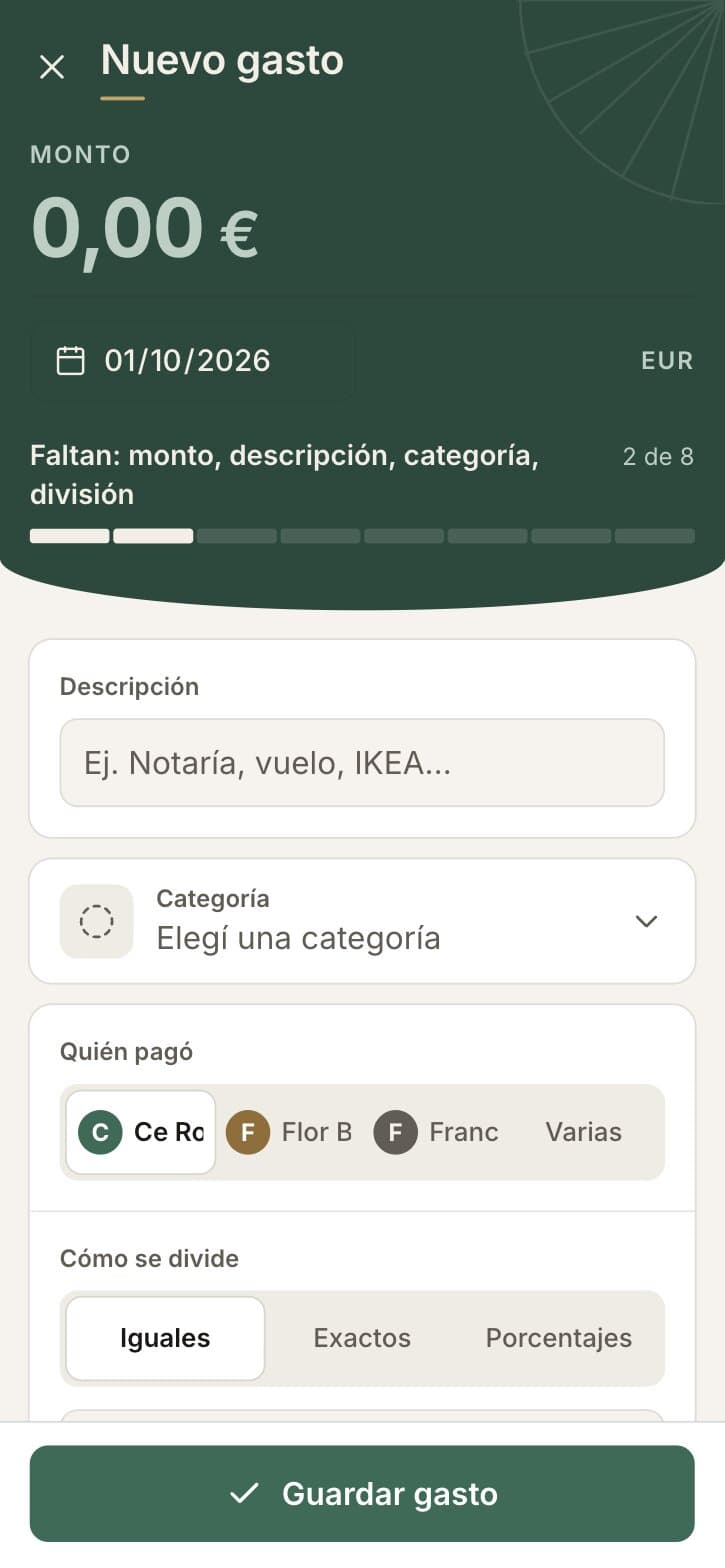
New expense
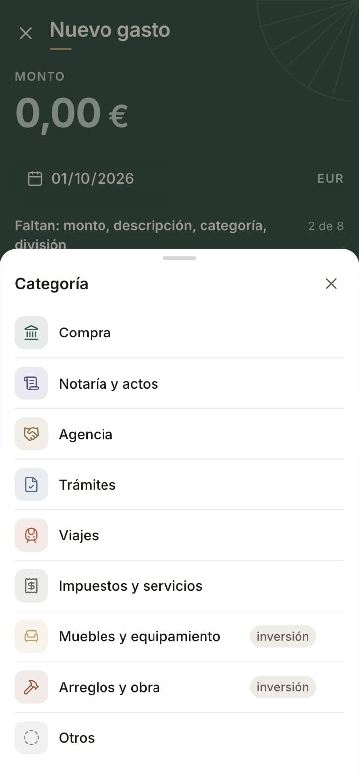
Category
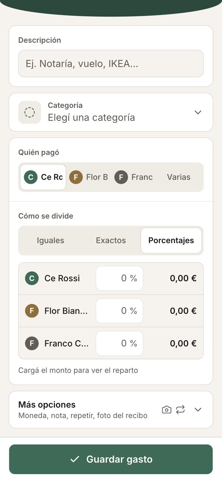
Split
Three ways to split
Equal, exact amounts, or percentages, with the result shown per person as you type. Payments between members appear in the same ledger, marked as transfers, so the balance is always one list.
Categories with meaning
Each category has an icon and a soft tint that is reused in the list, the chips, the summary bars and the filters. A flag marks the categories that count as investment in the property, so the summary separates spending from value added.
Notes, not just numbers
A board of ideas and pending tasks with three states, idea, pending, done, with comments and the author. Each expense also keeps its own comments and a change history.
Key decision
Coordination lives next to the money. The question "did we decide this?" is answered in the same app as "did we pay this?".
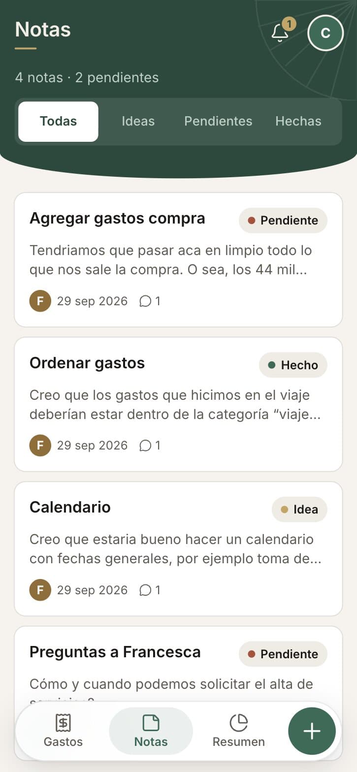
Notas
Summary and export
Total spent in any range, the share per person, investment in the property, spending by category and by month, and a CSV export.
Engineering notes
Next.js 16 on Vercel, Supabase for database, auth, storage and row-level security. Every table has policies, so a member can only read and write inside their own group. Receipt photos go to Supabase Storage. Push notifications through web push for new expenses, payments and comments. Charts with Recharts. Installable as a PWA with a tab bar and bottom sheets that follow the platform conventions.
Impact
Three people use it every day. The app is private and will stay private; what is shown here uses fictitious numbers.
What I would do differently
Decide the categories with the group before building. The list changed twice in the first week.
Smaller hero on desktop. The app is a phone column centred on a plain background. It is honest about being mobile first, but a desktop view that uses the width is on the list.
Team
Me, design and build. Two partners who use it every day and asked for most of the features.