





At a glance
Role. Founder, designer and builder. Product, brand, UX, content, code, billing, email and social.
Timeline. April 2026 to today. First commit 14 April 2026, live with paying users by September.
Stack. React 19, TypeScript, Vite, Clerk, Stripe, Resend, Cloudflare Pages. PWA, installable, works offline for lessons already loaded. Built with AI, in Claude Code and Cursor.
Status. Live at italianopernoi.com. 37 active users, 5 on the Pro plan.
The problem
Most language apps are built for everyone and feel like it: a mascot, a streak, a push notification at nine at night. For a Spanish speaker, Italian has a particular shape. Half the vocabulary is almost free, the other half is a trap of false friends, and the grammar is close enough to feel familiar and different enough to go wrong quietly. Nobody was teaching it from Spanish, slowly, with a voice that sounded like a person.
Constraints
One person, everything. Content, design, code, billing, email and Instagram all go through me. The product had to be small enough to maintain alone and clear enough to explain in one screen.
A phone, in short moments. The app is used on the way to work and in waiting rooms. Mobile first, installable, fast, and quiet: no streaks, no guilt.
Paid from the start. A Free plan with real value and a Pro plan at 3.33 euro per month, billed yearly. Stripe Checkout, a cancel button inside the profile, no dark patterns.
Two languages on every screen. The guide speaks Spanish. The ritual, the titles and the phrases are Italian. Every Italian line carries its Spanish gloss underneath.
Process
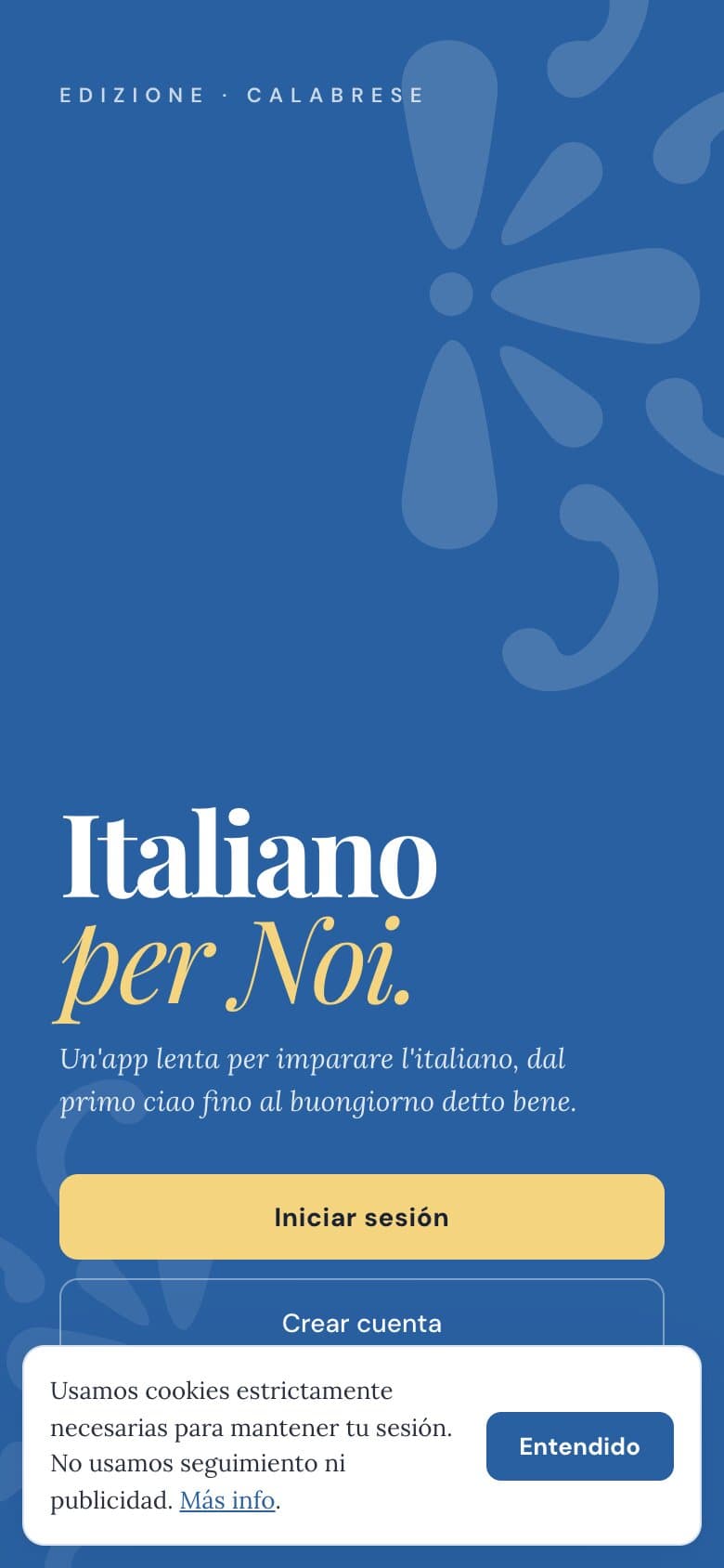
I started with content, not screens: the vocabulary themes, the phrases a beginner actually needs, and the order in which grammar should arrive. Then the brand. The concept lives in the code itself: Mediterraneo italiano, blu mare, giallo limone, bianco Amalfi. Blue for the primary actions, lemon yellow for the accents and Pro, an off white page, and a dark mode called notte di mare.
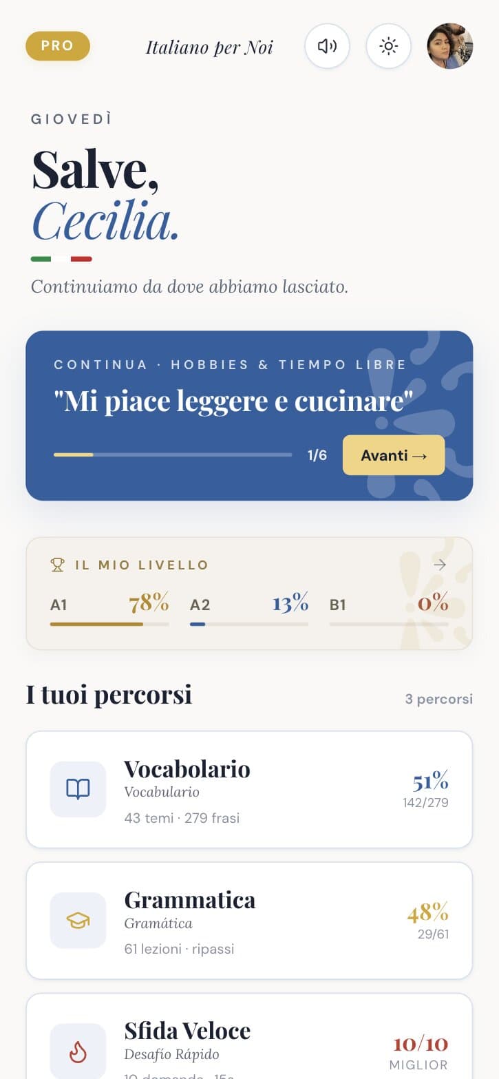
The typography is the voice of the product. Playfair Display for titles, with one word in italic and in colour ("Salve, Cecilia.", "Il mio livello"). Lora for the lesson text. DM Sans for eyebrows and buttons, in small caps with wide tracking: CAPITOLO · II · LIVELLO A1. It reads like a book, not like a dashboard.
Welcome
Home
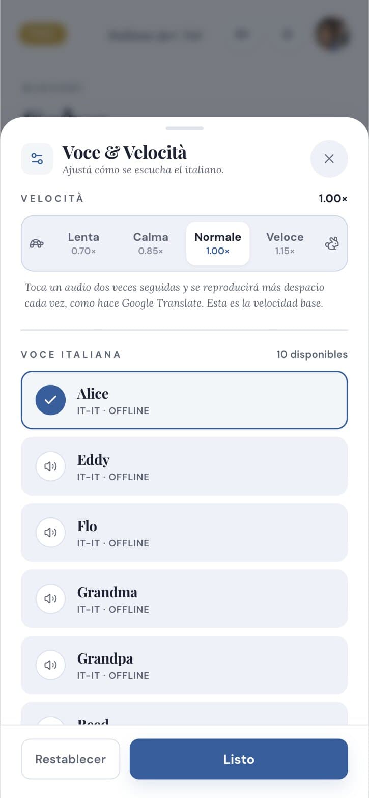
Settings
In May I wrote the design system down: three primitives, the tokens, the patterns, and an audit of what I had built and then discarded after eight pull requests. In September I ran a full UX audit of the live app and resolved the findings in three parallel work streams.
Launch was content too. Email broadcasts through Resend, an Instagram pipeline that generates posts and reels, and a September campaign that offered Pro for free with a code.
Solution
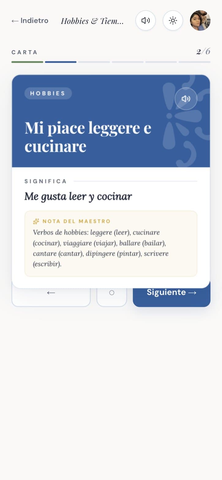
Vocabulary as cards, with a teacher's note
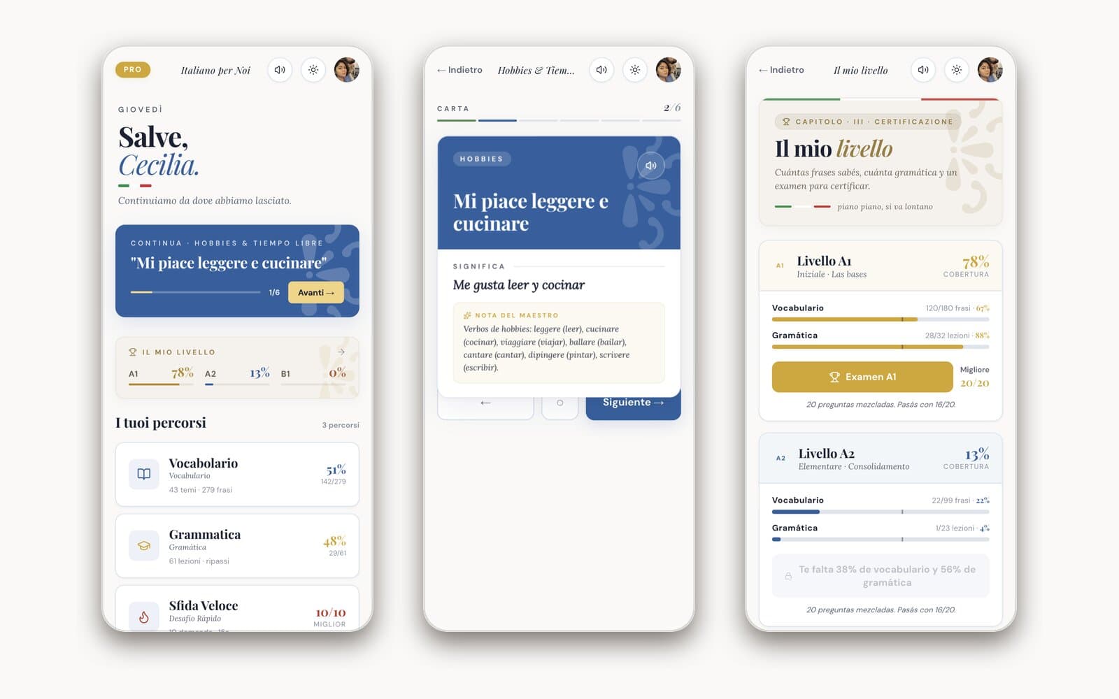
Each theme is a deck of phrases. A card shows the Italian, you reveal the Spanish, and a "Nota del maestro" explains the grammar hiding inside the phrase. Audio plays at normal speed and slowly.
Key decision
The reveal is a tap, not a swipe. Fewer gestures to learn, and it works the same on every phone.
Trade-off
The revealed card is tall. On small screens it can cover the navigation buttons. It is on the list.
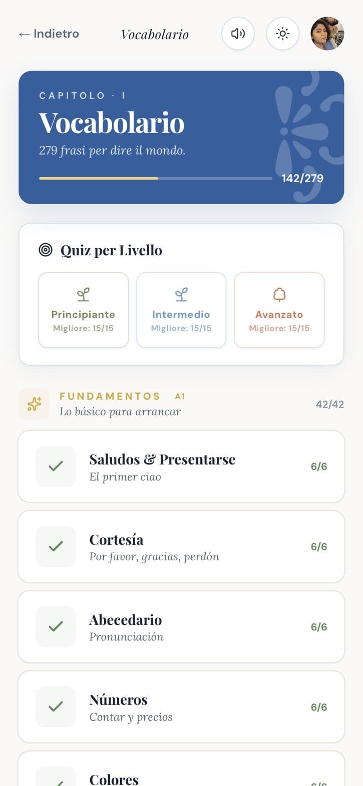
Themes
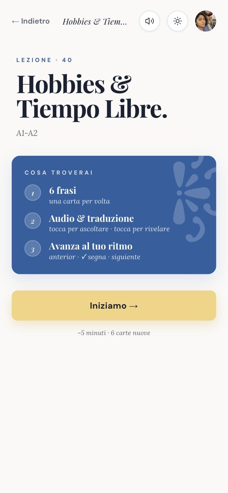
Lesson
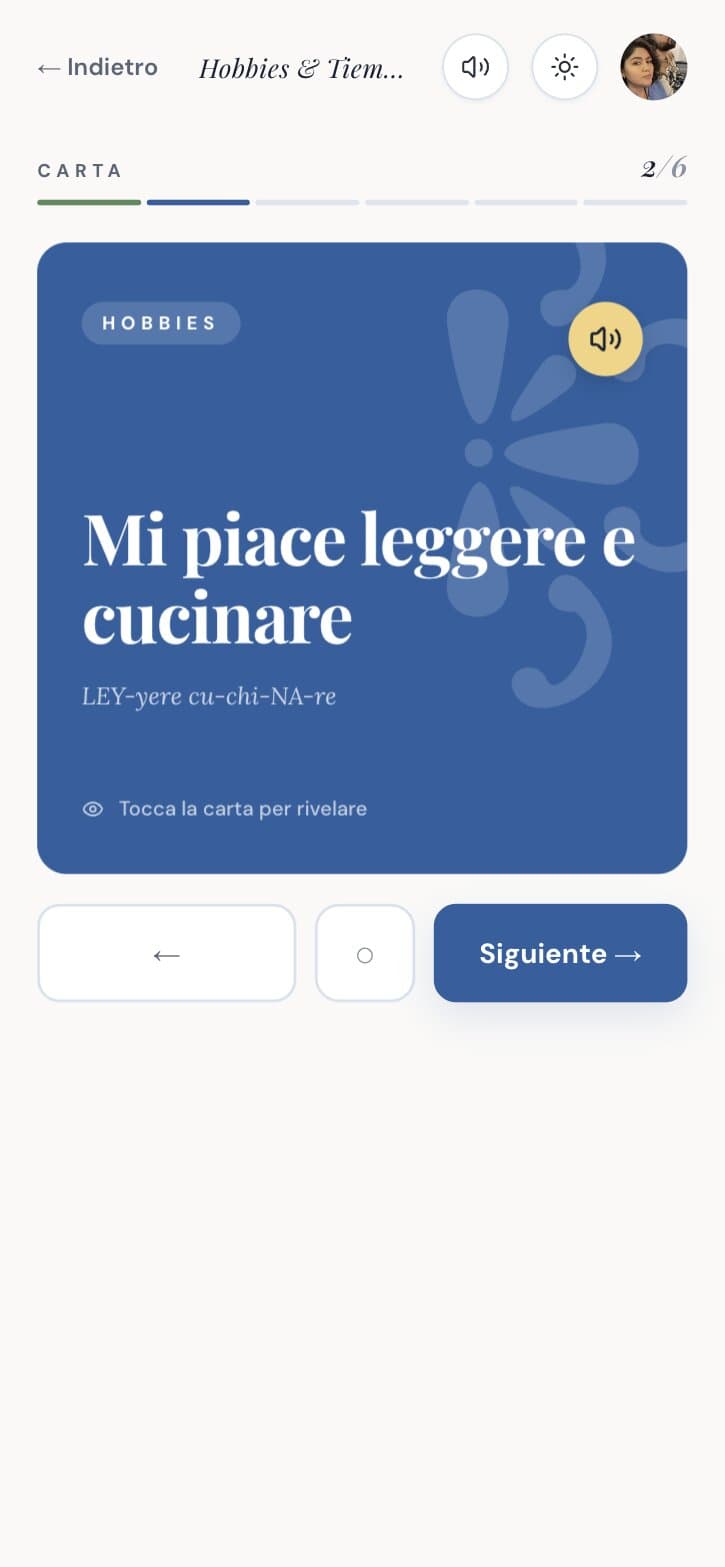
Card
Revealed
Quizzes with honest feedback
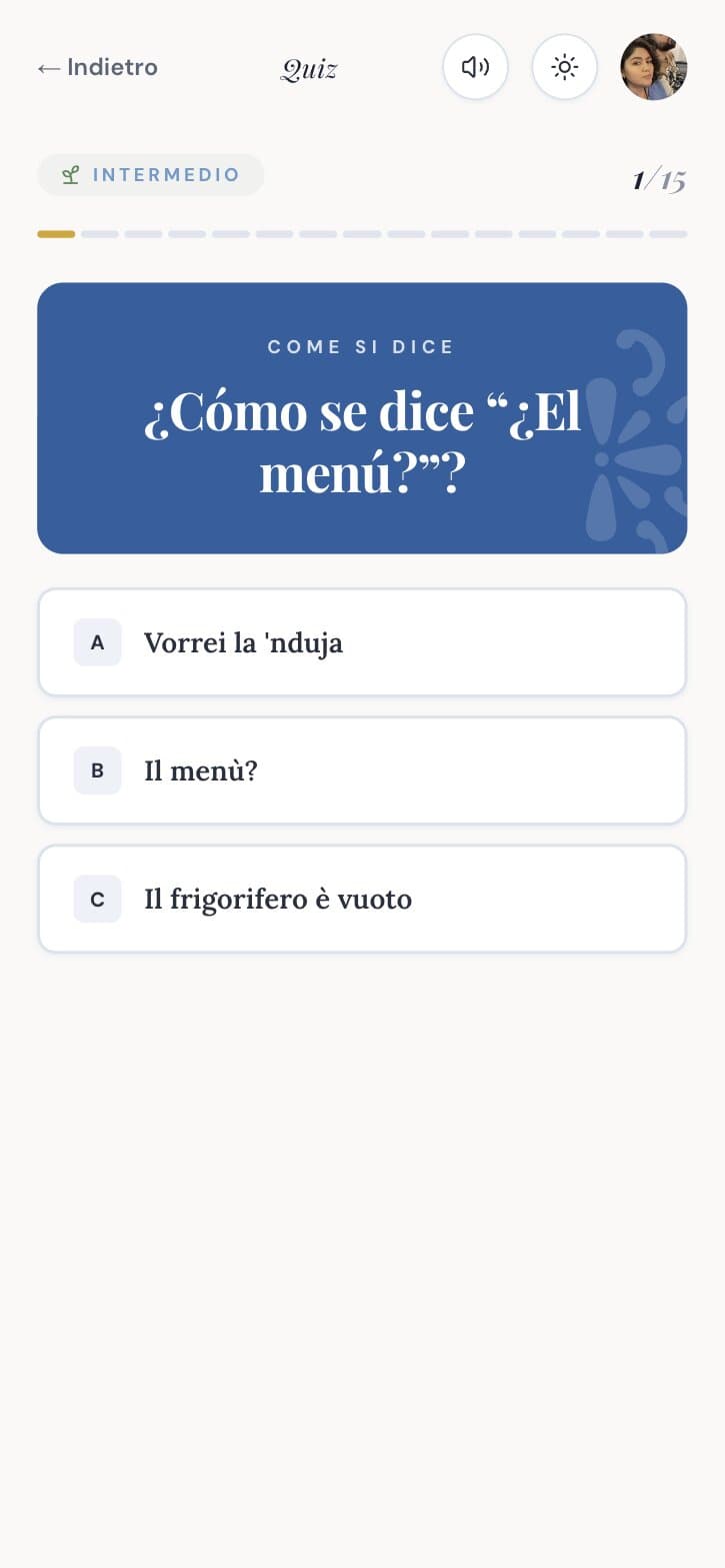
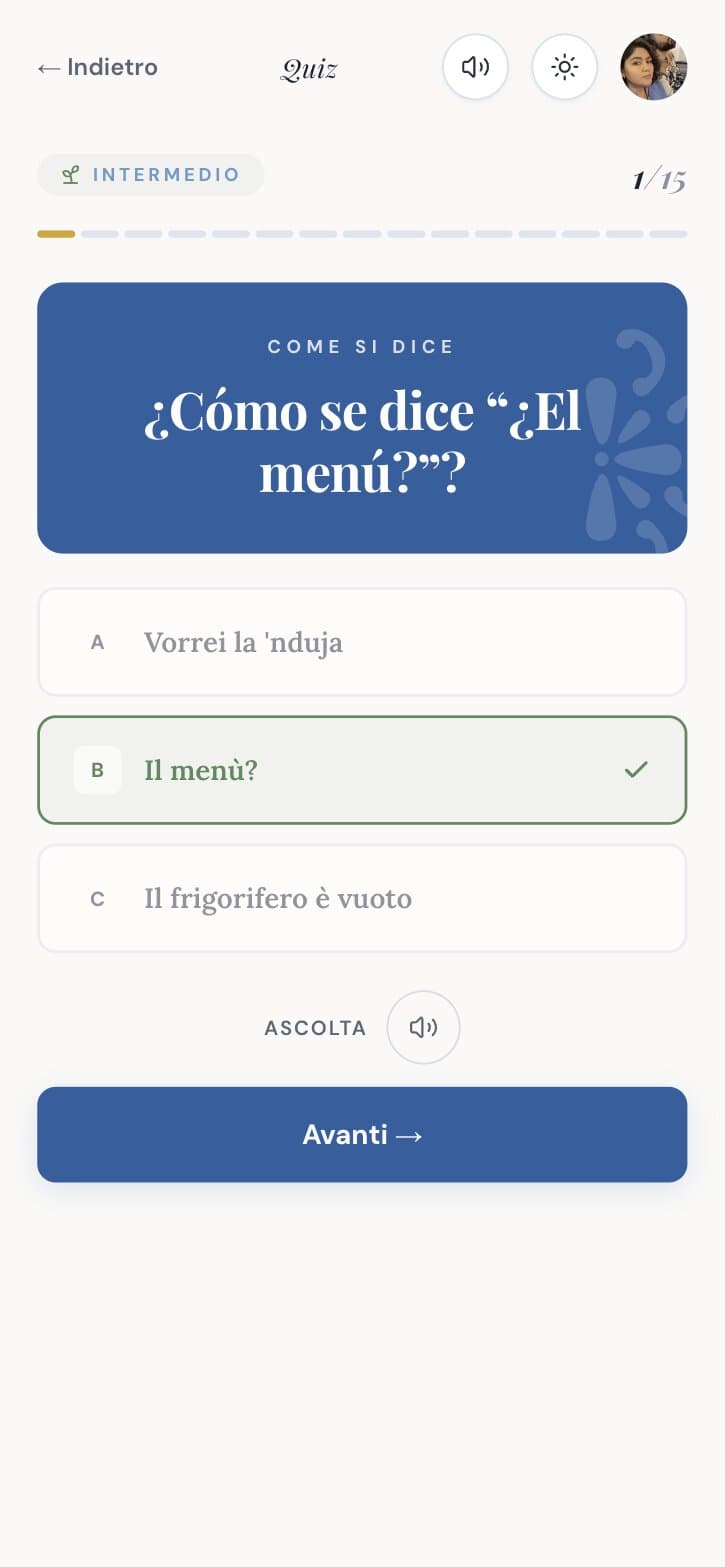
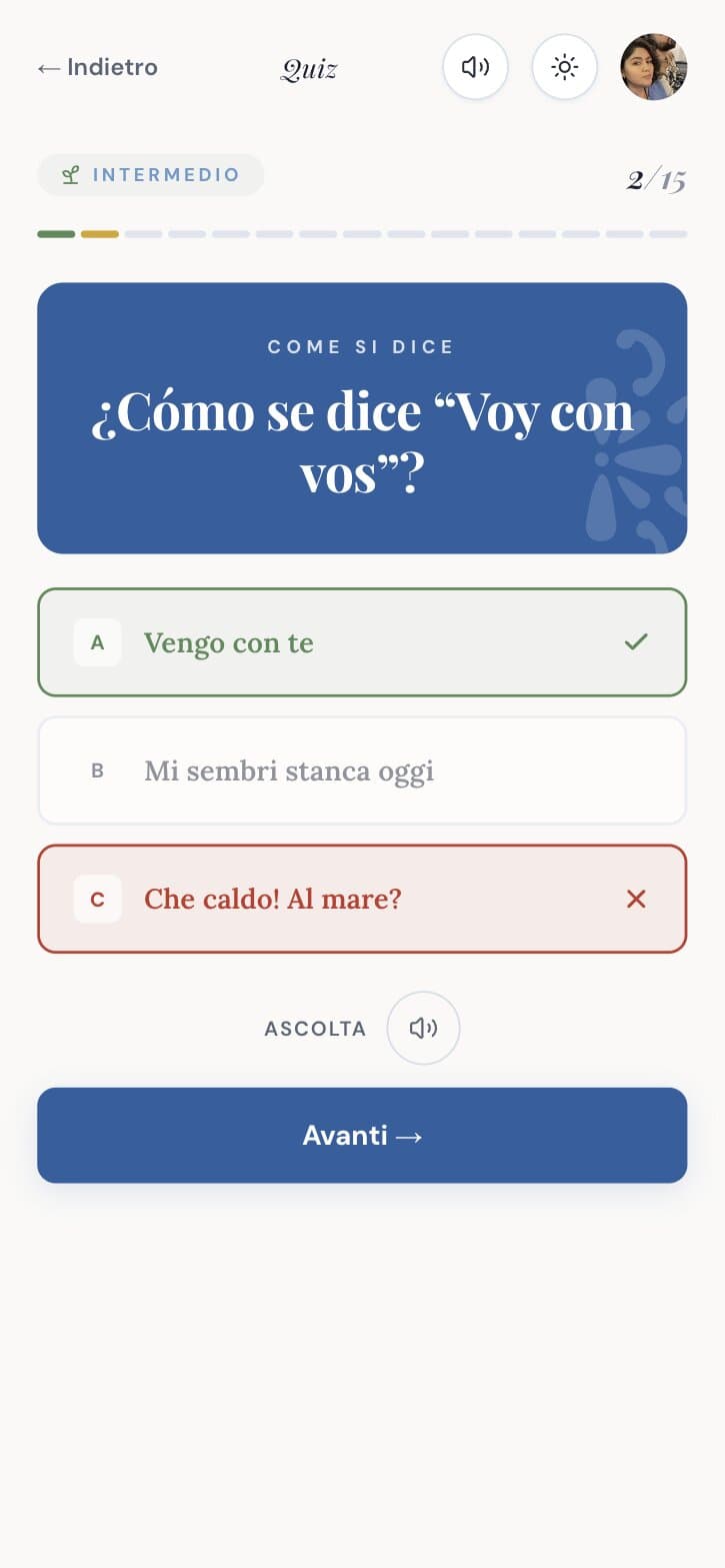
Multiple choice from Spanish to Italian. A right answer turns green with a check, a wrong one turns red with a cross and shows the right option. Fifteen questions, a score, and a path to the next level.
Key decision
Feedback uses colour and an icon together, so it works for colour blind users. A wrong answer never shakes or buzzes.
Question
Right
Wrong
A level passport
One card shows where you are: A1, A2, B1, with vocabulary and grammar coverage per level and the exam that certifies it. The levels have their own colours, gold, blue and terracotta.
Key decision
Progress is shown as coverage, not as a streak. You can leave for a month and come back without being punished.
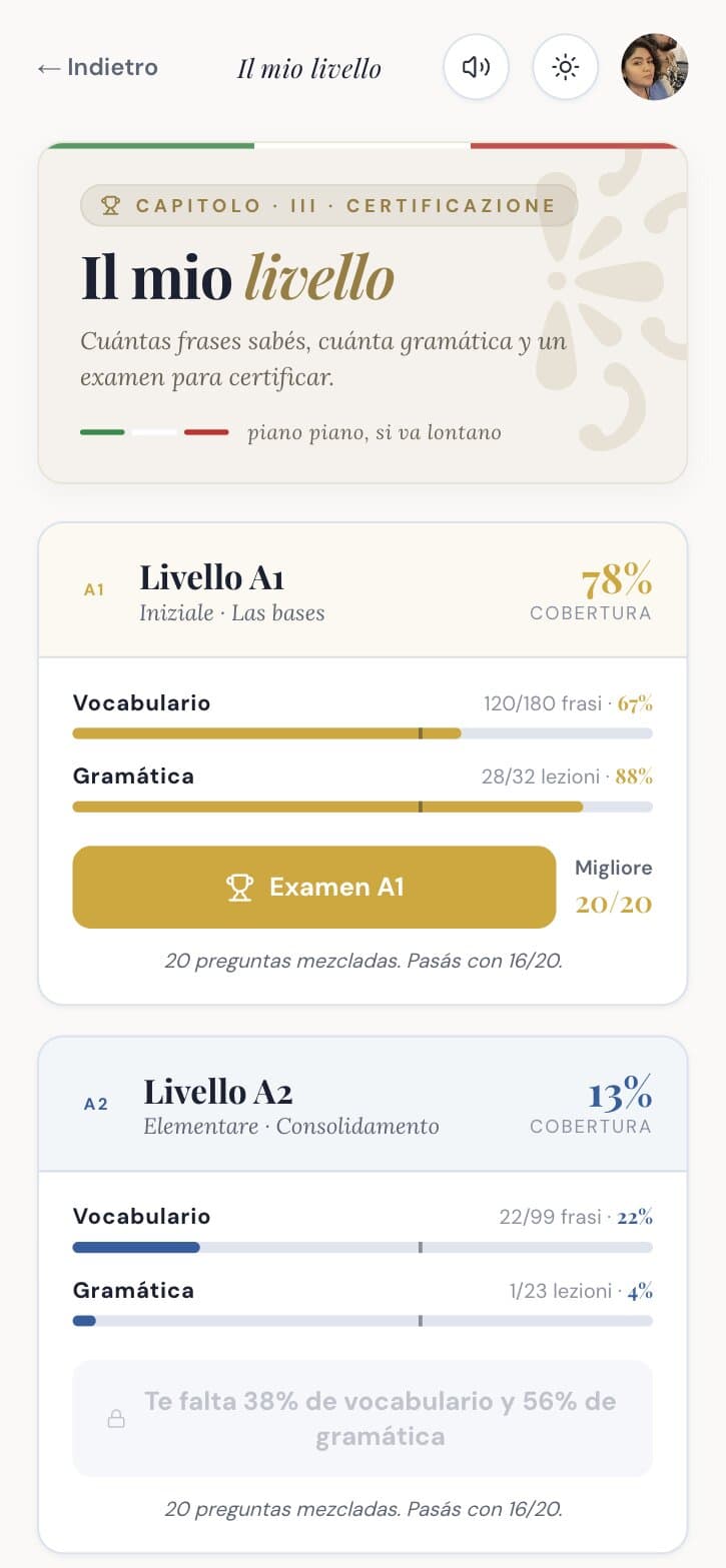
Il mio livello
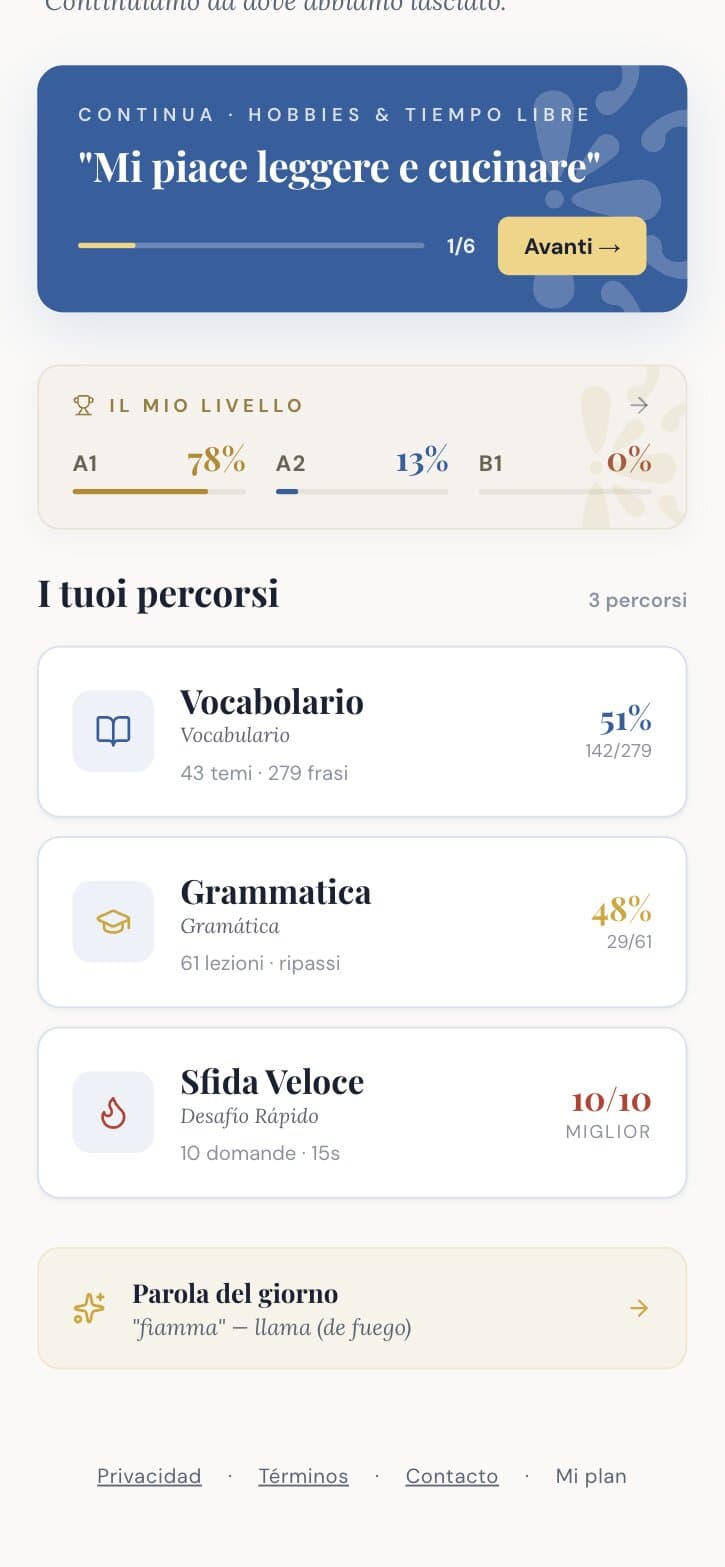
On the home
Grammar in chapters
Each level is a path of lessons with theory, exercises and a checkpoint. Chapter names in Italian, explanations in Spanish.
Trade-off
There is no spaced repetition yet. The checkpoints do the review for now, and I would rather say that than promise it.
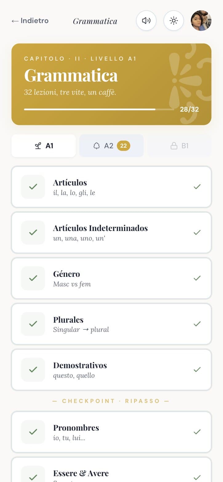
A1 path
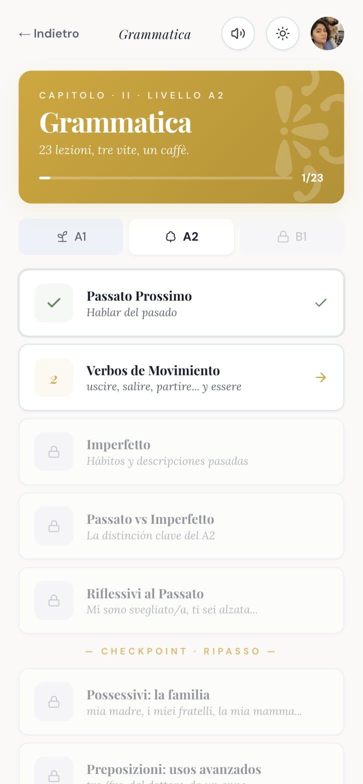
A2 path
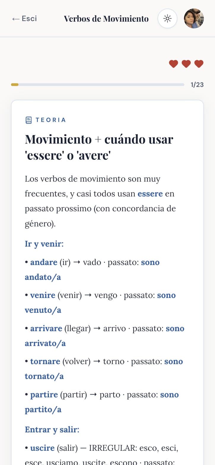
Theory
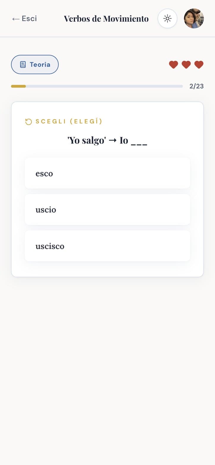
Exercise
Sfida Veloce
A timed challenge, ten questions against the clock, with a daily best score.
Key decision
It is the only fast thing in the app, and it is optional.
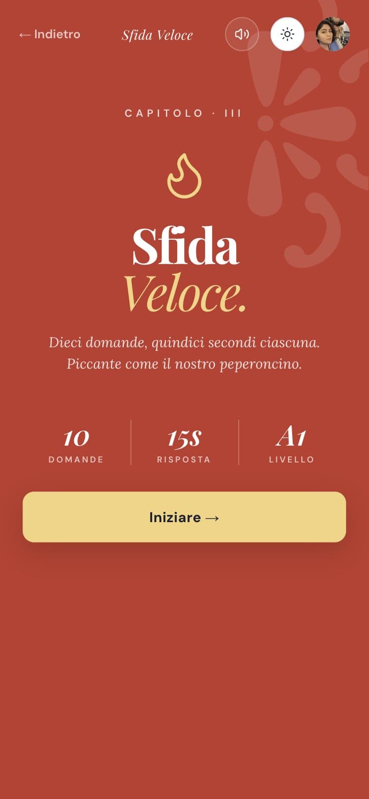
Start
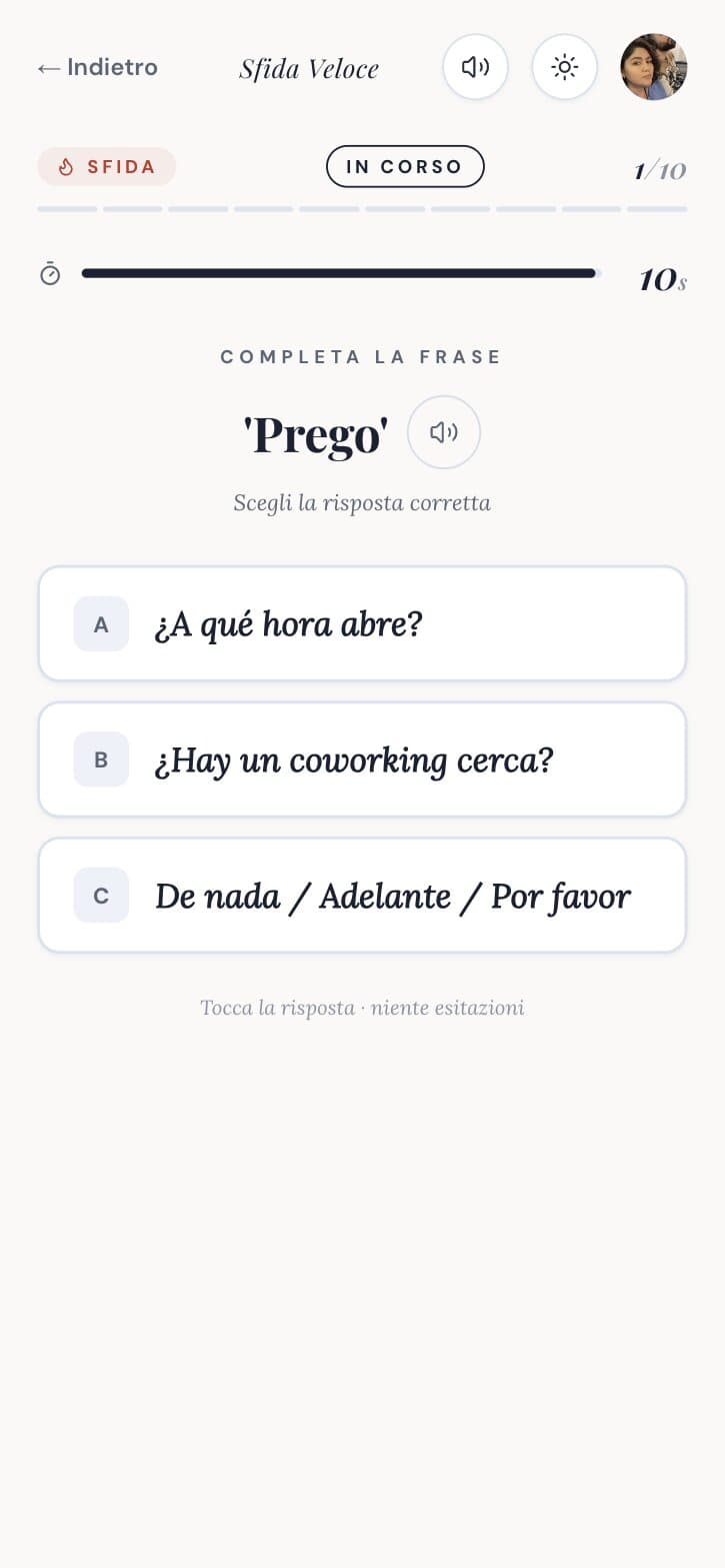
Against the clock
Free and Pro
Free gives the A1 base: vocabulary, two grammar lessons a day, quizzes, the daily challenge and the A1 exam, for ever, with no card. Pro opens everything for 3.33 euro a month, billed yearly, and can be cancelled from the profile.
Key decision
The pricing page says how to cancel before you pay.
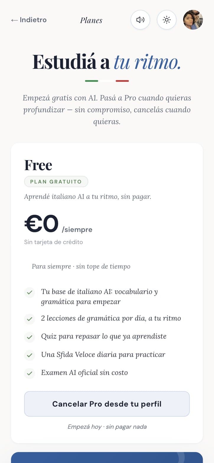
Free
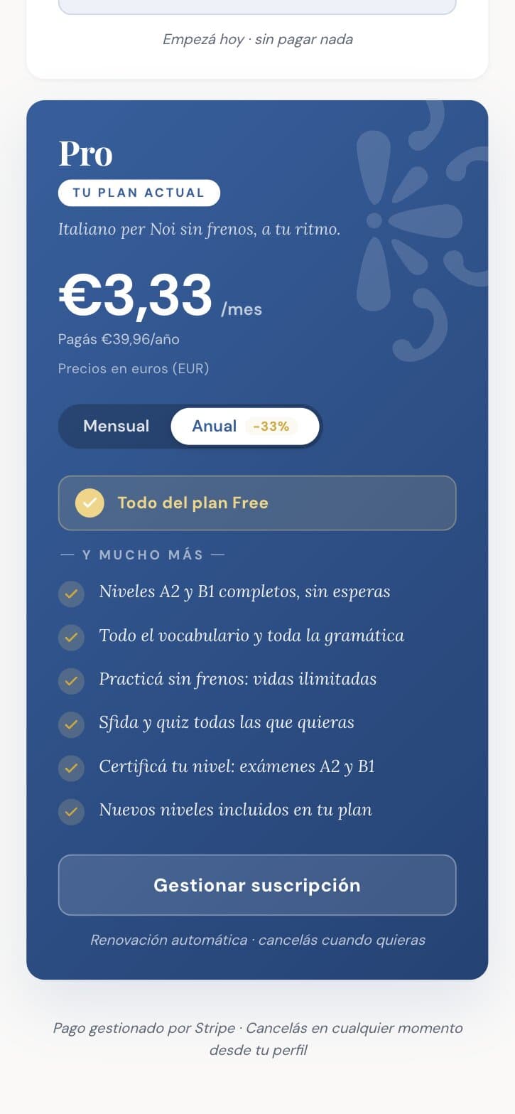
Pro
Design system
The system is small and documented. Tokens for colour with three steps each (base, soft fill, medium ring), fluid type sizes, one radius scale, one tile pattern as the only decorative motif, and a tricolour seal used only as a small stamp, never as a surface. Hover states do not fire on touch. Motion respects the reduce motion preference.
Impact
As of 25 September 2026: 37 active users and 5 on Pro. Everyone came through word of mouth, Instagram and email. No paid acquisition.
The bigger result is structural. The codebase became a platform: Bem Tuga, a European Portuguese app for expats in Portugal, is built on the same base and is launching now.
What I would do differently
Fix contrast before adding features. The yellow buttons with white text do not pass contrast. I knew it, I shipped it, and it is still there.
Build the review loop earlier. Content came first and review came last. A learning app lives on review.
Write the design system in week one. It arrived in May, after eight pull requests of trial and error. The audit of what I threw away was useful, but cheaper to avoid.
Team
Me. Content, brand, UX, code, billing, email and social.