






At a glance
Role. Sole designer, through WeCreati. Brand identity, illustration system, merchandise, social templates, website design and, later, the site's translation and updates.
Client. DAT, Dança, Arte e TangoTerapia. A nonprofit in Portugal founded in 2023 that uses tango, dance and art as tools for social intervention and health with elderly and vulnerable groups.
Timeline. From the brand work to the present. dat-artesaude.com.
The problem
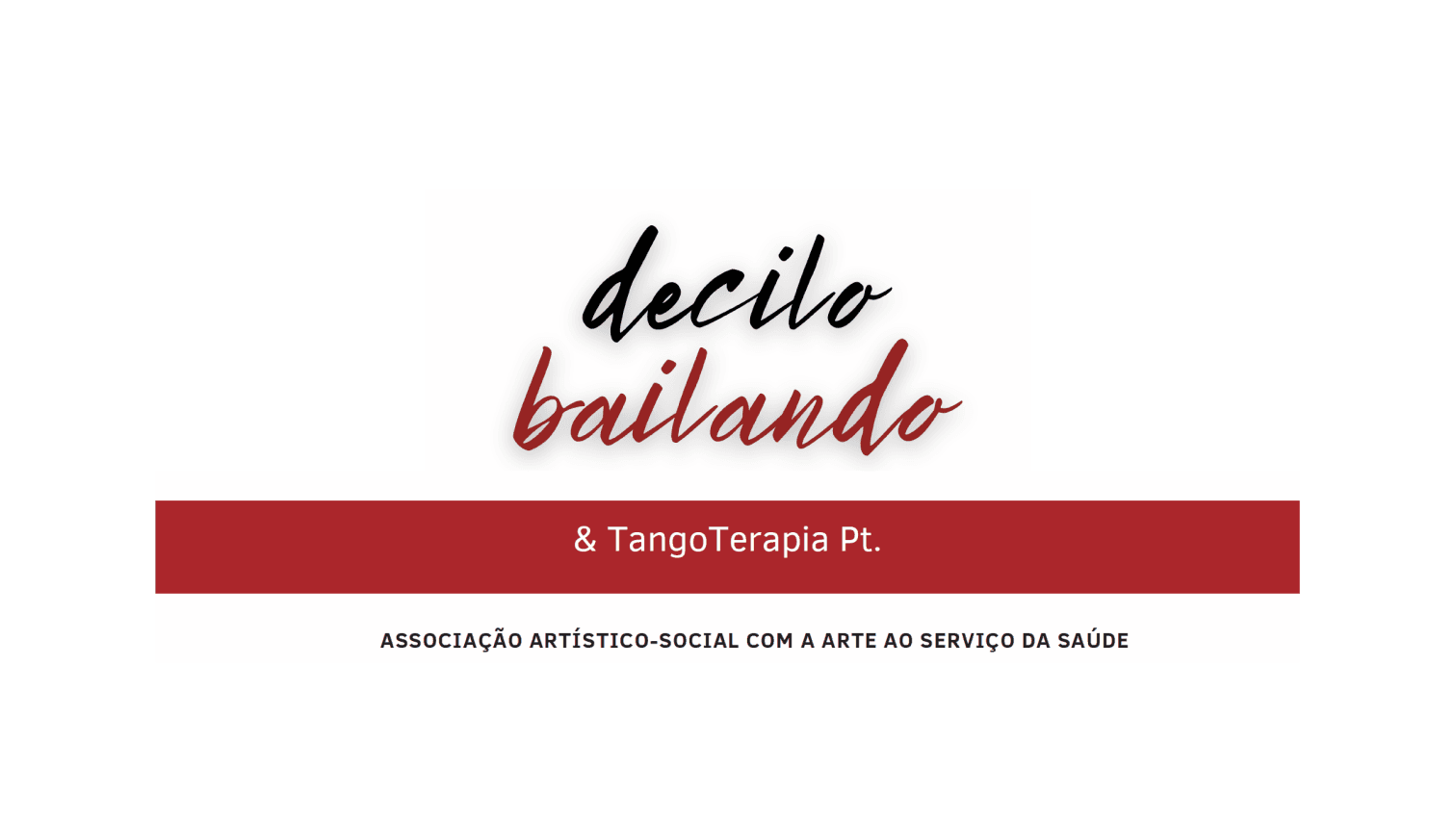
The organisation was working under the name "Decilo Bailando", a Spanish phrase that did not speak to a Portuguese audience. The visuals were script fonts with no system behind them, no consistency across flyers, social media and the website, and no way to explain that the NGO runs eight different programs. None of it showed the professionalism or the warmth of what they actually do in the room with people.
Before
After
Constraints
A nonprofit budget. Every deliverable had to be usable by the team without a designer on call: templates, a small set of rules, files they could print or post themselves.
Two cultures, one identity. Tango is Argentine; the organisation and its public are Portuguese. The brand had to feel at home in both without becoming a cliché of either.
Eight programs, one voice. Each program needed to be recognisable on its own and still read as DAT.
Process
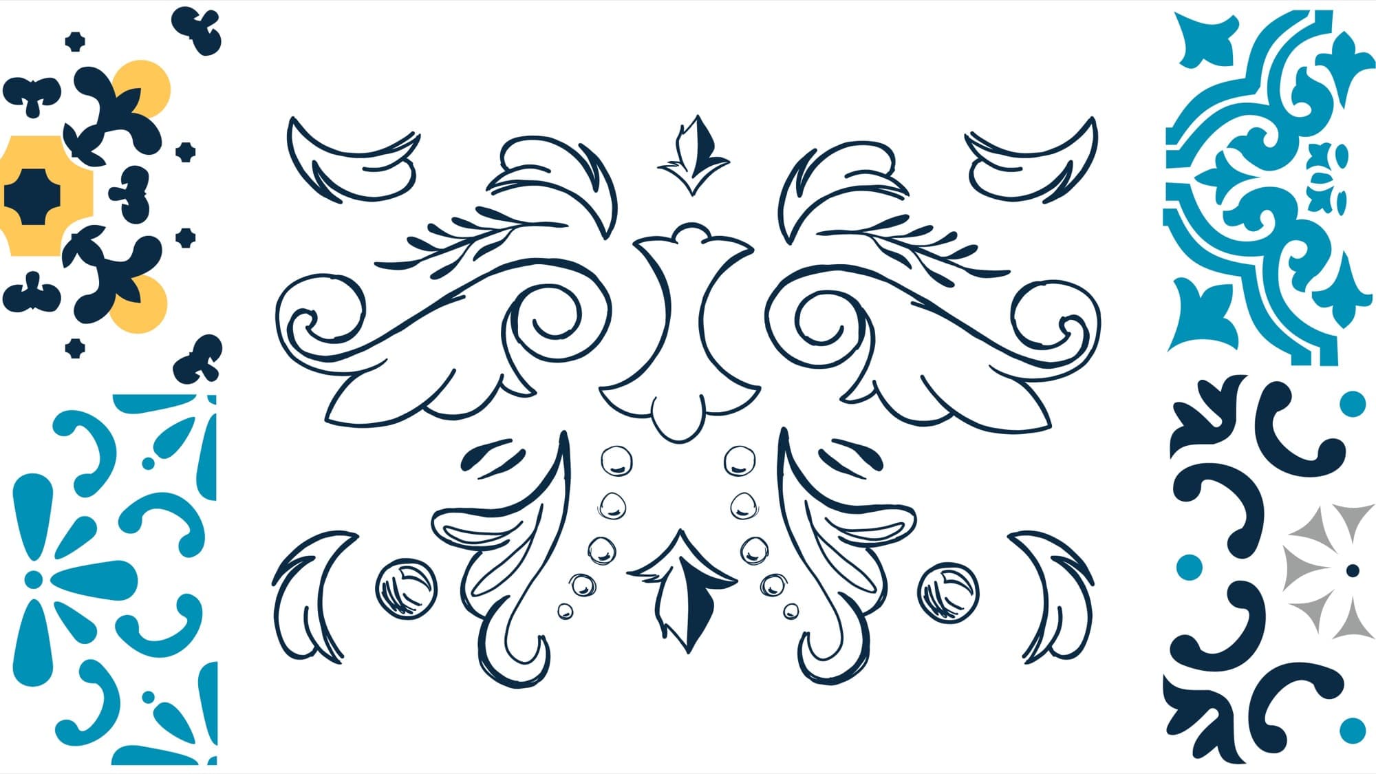
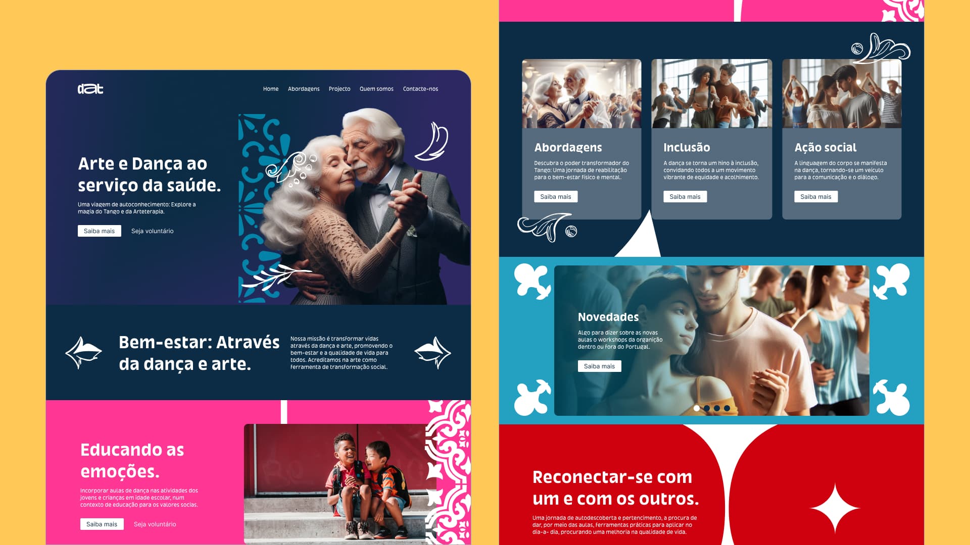
I looked for the visual bridge between the two cultures and found it in ornament. Portuguese azulejos, the hand-painted tiles, and Argentine fileteado, the ornamental lettering and flourishes born in Buenos Aires alongside tango, share a love of line, symmetry and colour. That pairing became the illustration system: patterns, frames and details that could be tiled, cropped and recoloured.
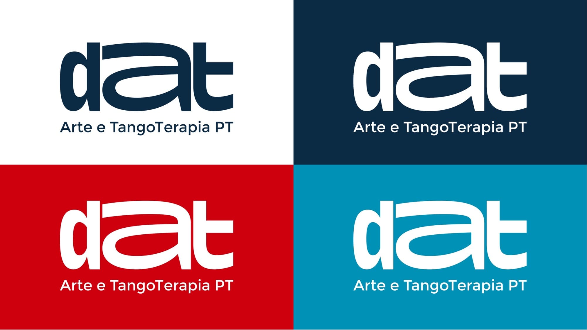
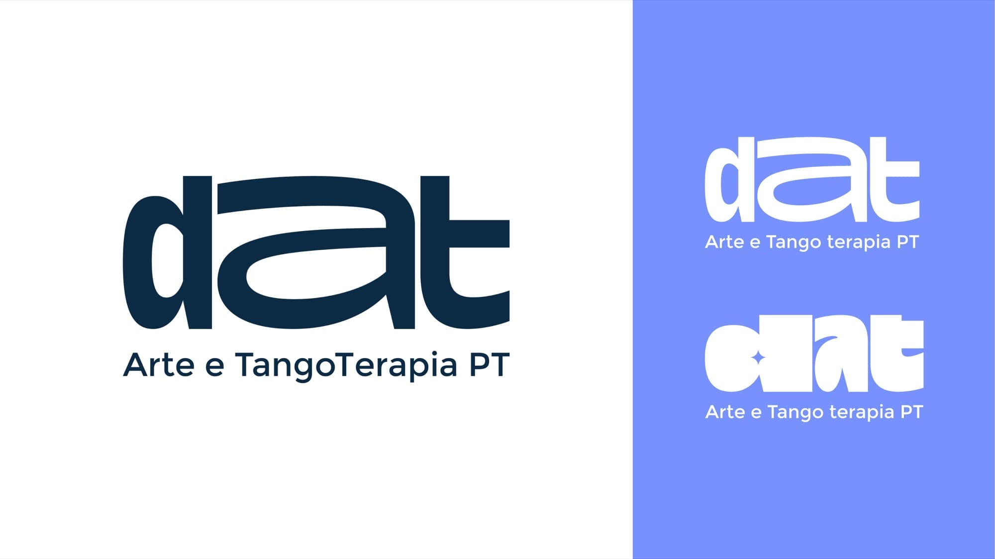
From there I built the logo as a system rather than a single mark: one shape, four colour variations for different backgrounds and moods, and eight sub-brand versions, each with its own colour and icon, so a program flyer says which program it is before you read a word.
Solution
Logo system and colours
What it does. One logo, four colourways, and rules for where each one lives.
Key decision
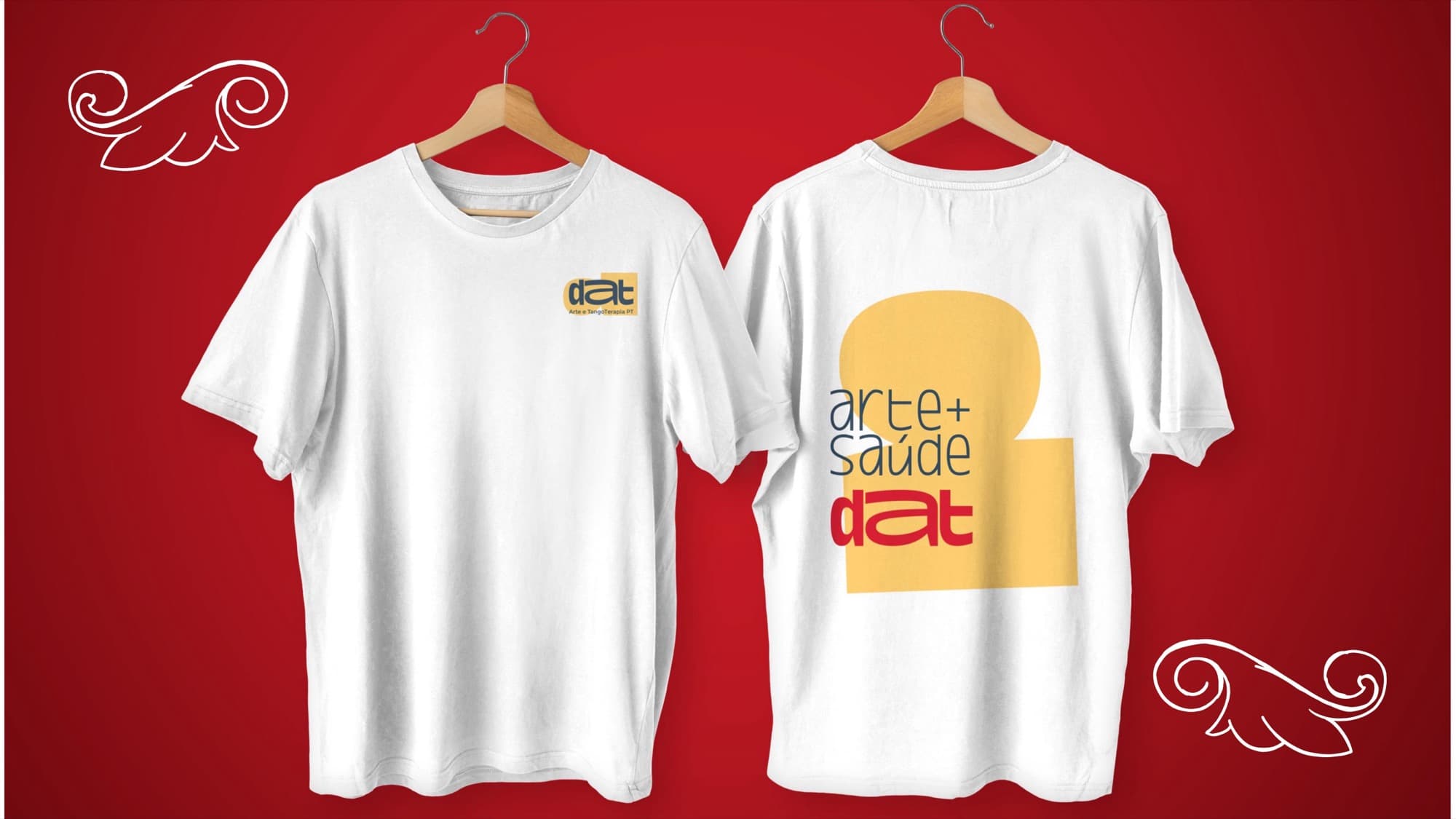
Design the variations first, not as an afterthought. A nonprofit prints on whatever it has: white paper, coloured tote bags, a phone screen. The system had to survive all of them.
Eight sub-brands
What it does. Each program gets a colour and an icon variation of the logo, under the DAT umbrella.
Trade-off
More assets to maintain. It works because the variations follow one rule, so a new program can be added without redesigning anything.
Illustration library
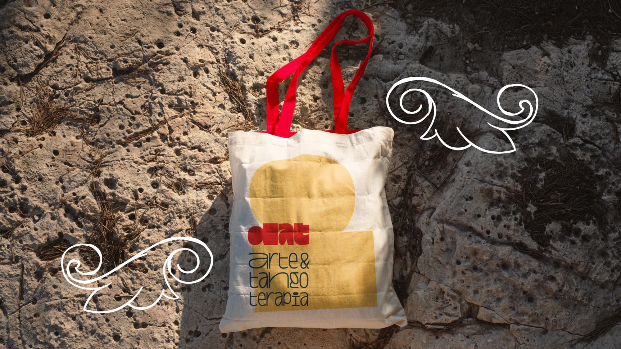
What it does. Azulejo and fileteado patterns and details used on merchandise, social posts and the website.
Merchandise and social media
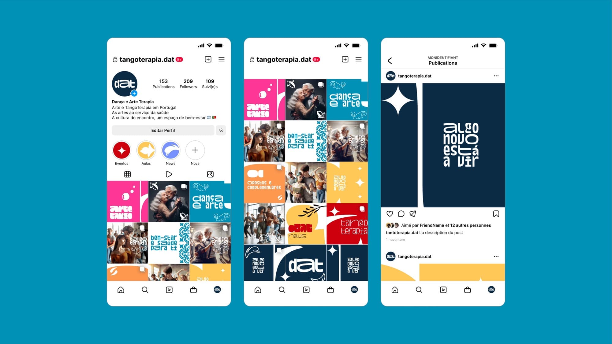
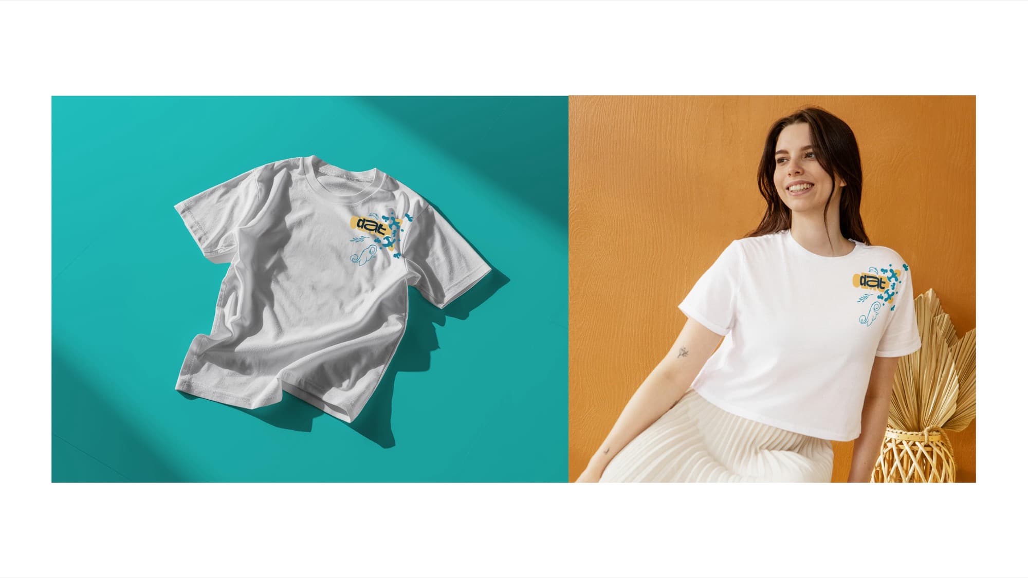
What it does. T-shirts, tote bags, and Instagram templates the team fills in themselves.
Website
What it does. The full website design, later built in WordPress.
Impact
The organisation adopted the brand in full and still uses it. Their Instagram runs on the new identity, and the sub-brand system simplified their communications: each program has a visual language of its own while staying part of DAT.
What I would do differently
Ship the brand guide with the brand. The rules lived in my files longer than in theirs. A two-page guide on day one would have saved questions later.
Team
Me, sole designer, through WeCreati. The DAT team on the client side.


