





At a glance
Role. Visual communication designer. Graduation project, done alone: research, strategy, brand, social, web design, print, environment.
Timeline. 2021. Presented in February 2022.
Context. Graduation project in Visual Communication Design, Faculty of Arts, National University of La Plata (UNLP), Argentina. Tutor: Laura Maiori.
Status. Graduation project. The foundation is real and adopted a large part of the material; the rest stayed as a proposal.
The problem
Bellamente is an Argentine foundation run by an interdisciplinary team (mental health, education, art, research, communication) with one mission: to promote the acceptance of body, sexual and gender diversity, and to free the next generations from the beauty mandates we grew up with. The diagnosis in the brief was blunt: the current beauty paradigm pushes most people to the margins.
The foundation had a name and a cause, but not a voice. The mark was weak, the channels did not look like one organisation, and the content did not reach the people it was for. The project's guiding idea was four verbs: Romper. Decidir. Cuestionar. Accionar. Break, decide, question, act.
Constraints
A foundation, not a brand. No budget for production, a team that would have to run the channels themselves, and a cause where the tone matters more than the polish.
Real bodies. The photography could not do what beauty advertising does. No retouching, no filters, no casting for a type.
Every channel at once. The brief asked for the mark, the system, the strategy, educational content, social media, the website, print and physical interventions. One year, one student.
Process
I started with the people the foundation serves and the channels they actually use, and set seven objectives: redesign the mark, build a uniform and recognisable identity system, develop an integral communication strategy, generate educational content, create inclusive and cohesive content, extend the foundation's online universe, and intervene physical spaces with events and workshops.
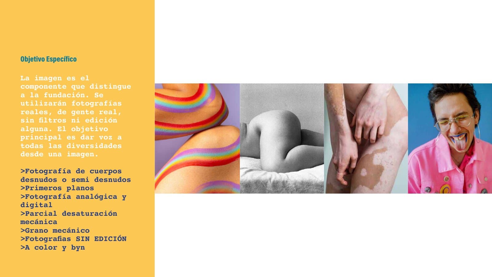
The mark came from typography. Extenda, a wide extended face, became both the logo and the voice: stacked, tight, loud, with a pink frame that holds the word "Fundación". The reductions go down to a single "B" in the frame, so the brand survives a pin, a sticker and a profile picture.
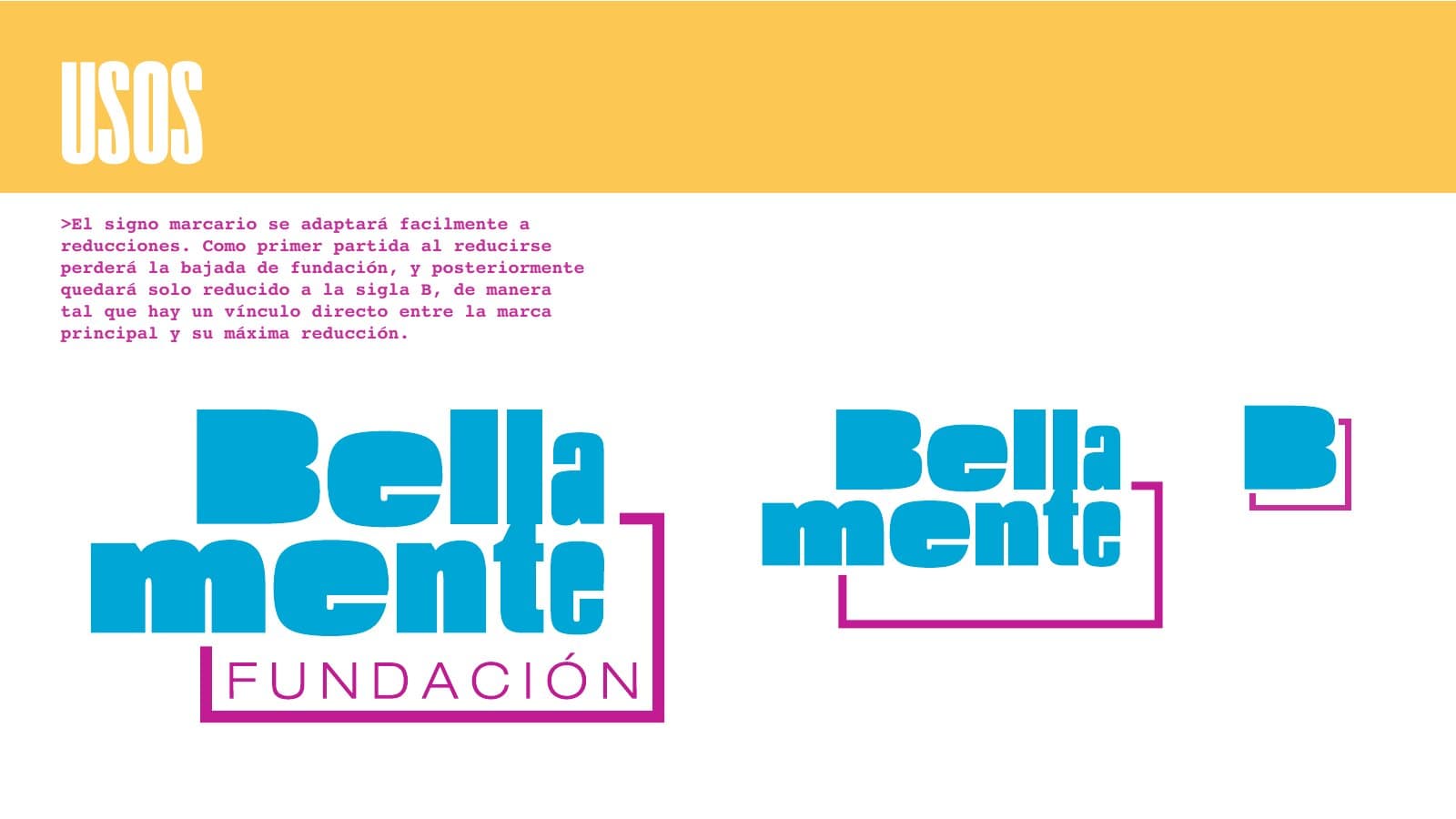
The palette is the pride flag read as a system: yellow, cyan, magenta, green, orange and two blues, each with a job. Yellow is the ground, the rest are flags you raise on it.
Mark
Palette
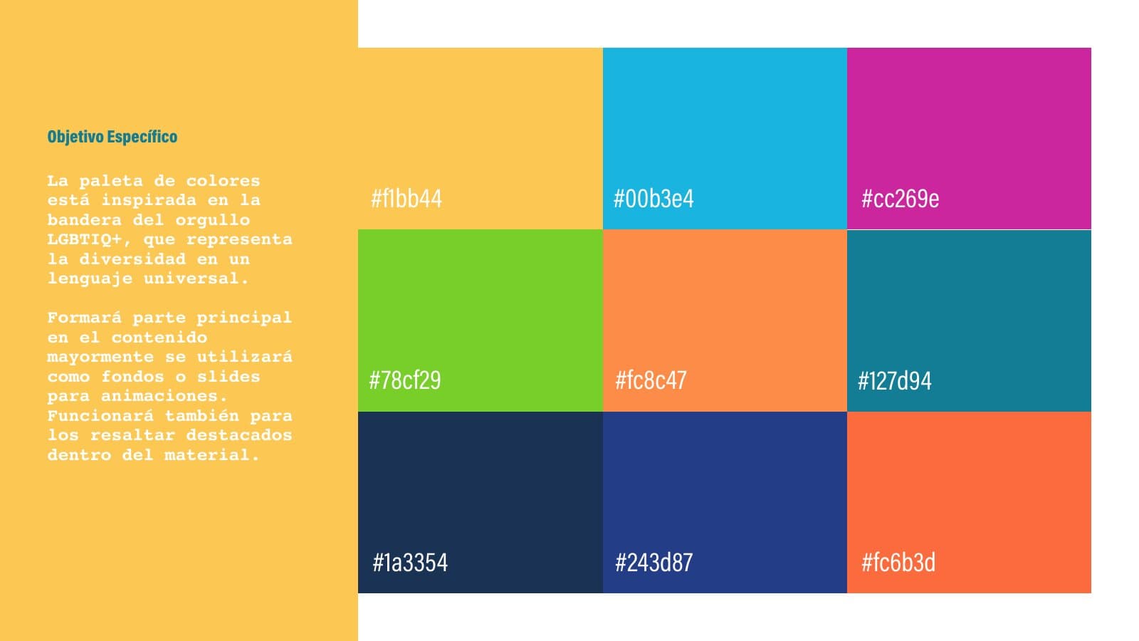
Photography was a rule, not a style: real bodies, close, unedited, with analogue grain. Line illustration in graphite for the moments where a photo would be too much.
Solution
A mark that is also a headline
The extended type does the talking. The same typographic device becomes awareness pieces where a single word fills the frame: CUIDADO, BISEXUAL, LESBIANA.
Key decision
Type as image. A foundation cannot buy imagery every week; it can always set a word.
Instagram as the main channel
Three content families: institutional, awareness (#antibellamente) and community. Templates the team can fill in, with the colour system doing the recognition work. The strongest pieces are the ones with bodies in them: posts and posters built on real, unedited photography, with the extended type laid over the skin like a headline.
Trade-off
Instagram rewards the opposite of the foundation's message. The strategy accepts the channel and subverts the format: real faces, blunt words.
A mobile-first website
One place for everything the foundation offers: resources, events, the newsletter. Designed mobile first, with a small UI kit (type, palette, icons, buttons, menu) so it could be built without me.
The street
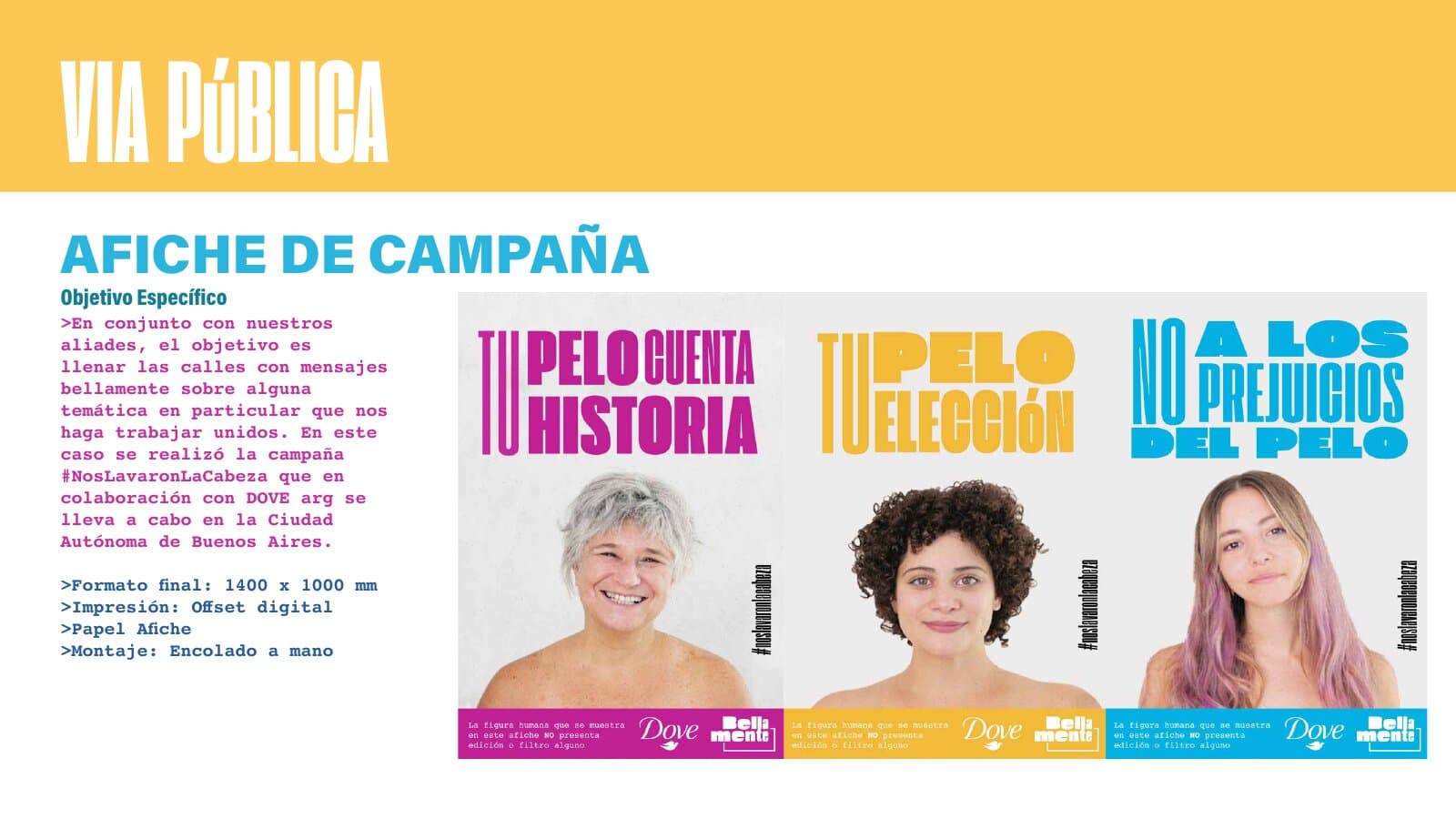
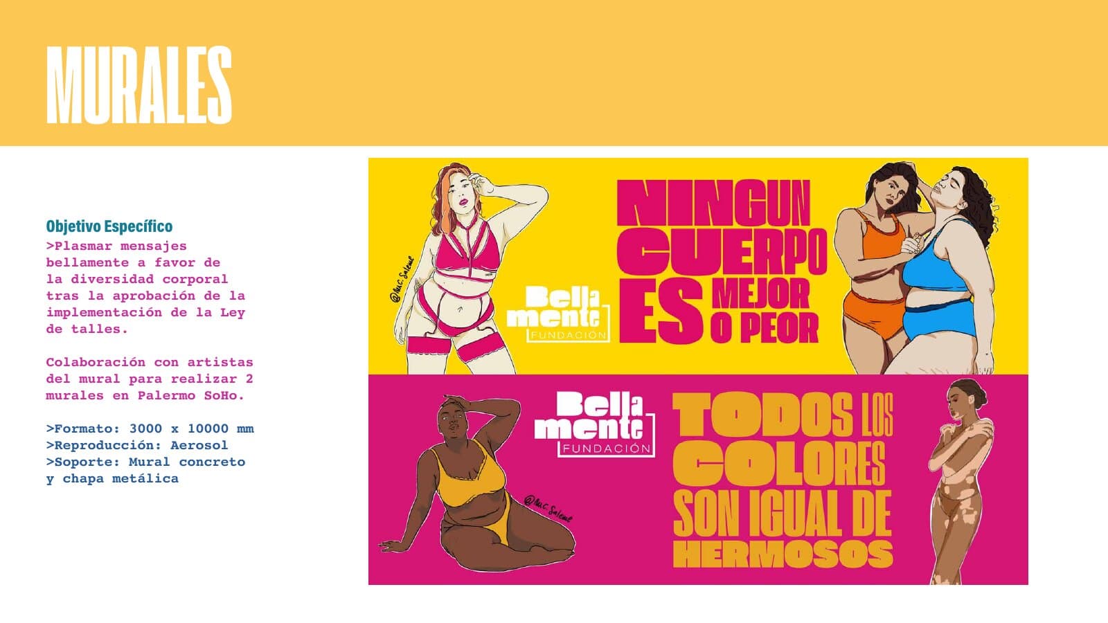
A campaign proposal, #NosLavaronLaCabeza, imagined as a collaboration with Dove Argentina: three women and three lines about hair, "Tu pelo cuenta historia", "Tu pelo, tu elección", "No a los prejuicios del pelo". It stayed inside the thesis; it was never produced. Murals in Palermo Soho supporting the Ley de Talles (the sizing law). Stands, banners, stickers, pins, a flag.
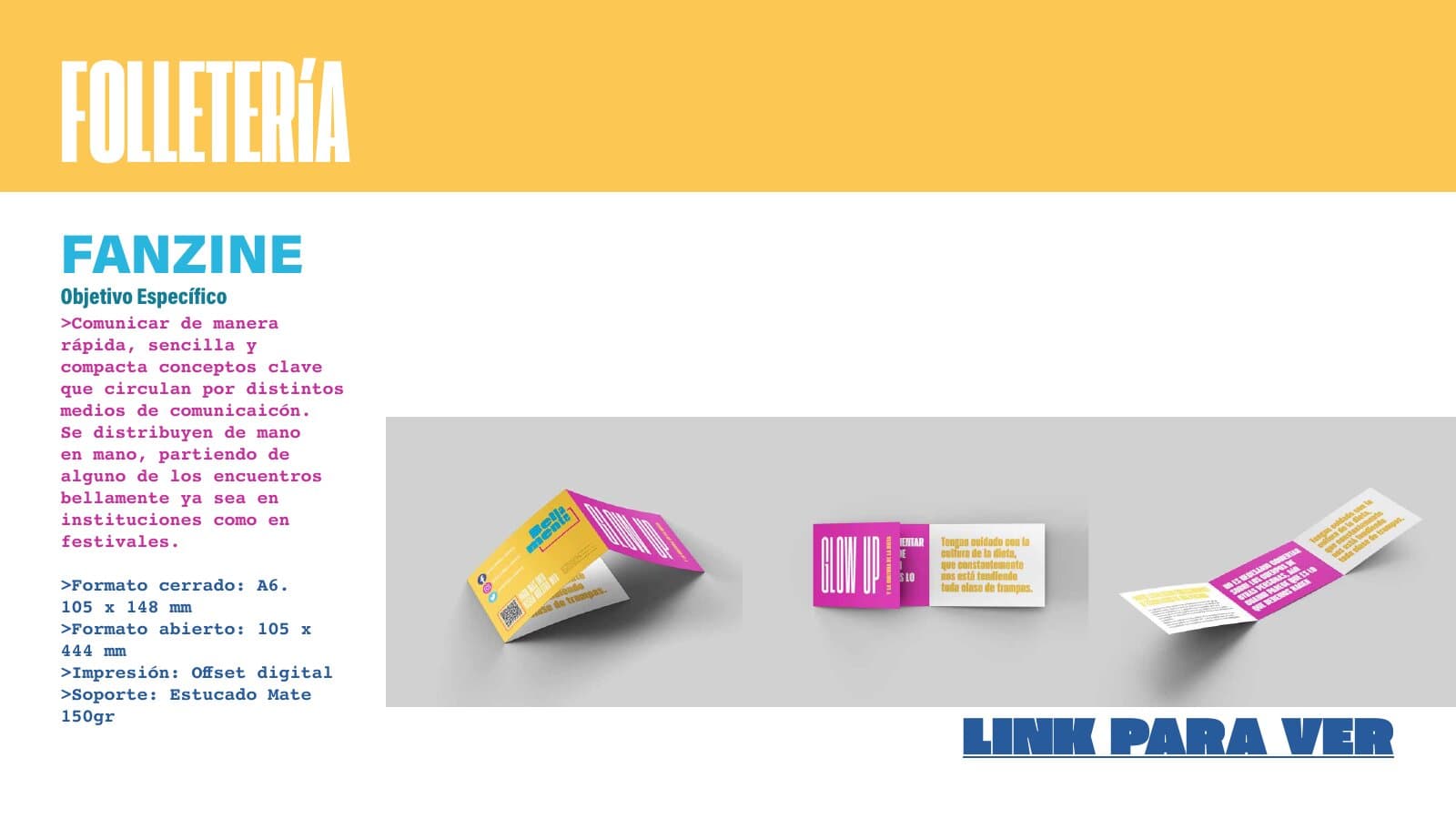
A fanzine (A6 closed, offset, 150 g uncoated), an information guide and infographics: the educational content, in the smallest format that travels hand to hand.
Impact
The foundation used a large part of the material: the identity and the social pieces went into their channels. Not the whole project made it out of the thesis; the campaign and the physical interventions stayed as proposals. It lives in the Trash folder of this portfolio because it is early work, and because I keep what taught me something.
What I would do differently
Fewer deliverables, deeper. Seven objectives across every channel was the brief, and I delivered all of it. Today I would choose three and make them real with the team.
Test the voice with the community. The tone was decided at the desk. The people the foundation serves should have read the first posters before they were designed.
Keep the sources. The project survives as one PDF. The InDesign and Illustrator files are gone. Everything here is rendered from that deck.
Team
Me, alone, as a graduation project. Tutor: Laura Maiori. Client: Fundación Bellamente.